
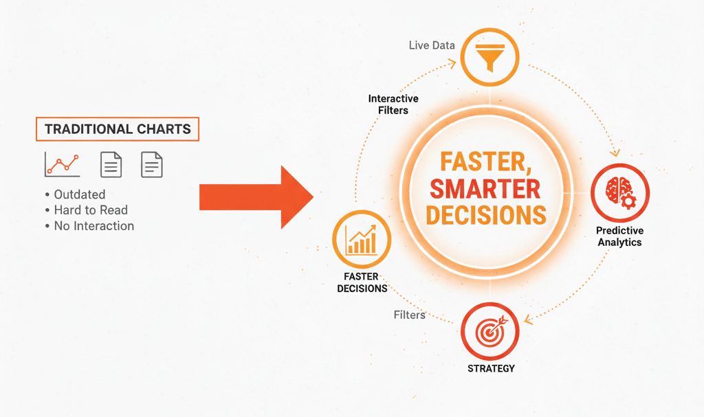
Slowed down by data overload? Standard dashboards show historical KPIs but fail to explain the why. SmartCharts can fix this bottleneck by turning passive reports into immediate action. They are strategists, not historians. SmartCharts analyze data automatically – and find root causes to provide context for fast decisions. This level of data visualization is vital for any company focused on continuous improvement. This article shows you what SmartCharts are and exactly when to deploy them for optimal results. Integrate these insights into your operational strategy and discover how these powerful charts can drive true operational excellence.
Understanding Smart Charts: What Are They?
The term “SmartChart” isn’t tied to a single, proprietary software. Instead, it represents a category of advanced data visualization tools designed to transform static data points into dynamic, actionable insights.
While a basic bar graph or line chart simply shows past results, a SmartChart aims to interpret the data, highlight key signals, and help you project future performance based on statistical rigor.
The Two Meanings of “SmartCharts”
The concept of a SmartChart generally falls into one of two widely used definitions:
1. The Statistical Process Control (SPC) Model
In the world of quality improvement and performance measurement, “SmartCharts” are often an approachable name for XmR Charts (Individual and Moving Range charts).
- What they do: They apply statistical process control (SPC) limits to your performance data (like monthly sales, website visits, or process times).
- The “Smart” Part: Instead of comparing this month to last month or to a static target (a common, but often misleading, habit), the SmartChart establishes “Natural Process Limits.” This tells you the expected range of routine variation in your data. Any point that breaks these limits is a true signal of a real, significant change—a change worth investigating—rather than just random noise.
- When to Use: Ideal for monitoring Key Performance Indicators (KPIs), tracking any ongoing business or operational process, and determining if a change you implemented actually worked.
2. The Interactive Data Visualization Model
In the context of modern Business Improvement and enterprise software, a SmartChart refers to a visualization with advanced, user-friendly features.
- What they do: They combine multiple layers of data, offer built-in filtering, drilling, and responsive design, often leveraging AI or machine learning algorithms.
- The “Smart” Part: These charts adapt to the user’s focus. You can click on a data segment to automatically filter an entire dashboard, view real-time projections, or receive automated alerts when a metric drifts too far from a defined benchmark.
- When to Use: Perfect for complex dashboards, financial modeling, real-time trading platforms, and any application where managers need to explore vast datasets quickly to make informed decisions.
In short, a SmartChart is about moving from simply seeing data to proactively acting on it.
How SmartCharts Elevate Decision-Making
SmartCharts aren’t just prettier graphs; they fundamentally change how we interact with data, shifting the focus from mere observation to strategic execution. Unlike static reports that offer a snapshot of the past, SmartCharts provide a living, breathing view of your business landscape. They embed sophisticated analytical capabilities directly into the visualization, allowing users to drill down into specifics, filter results on the fly, and even predict future trends without needing a data scientist by their side. This immediacy and depth mean that decision-makers can respond to market shifts, operational anomalies, or customer behavior with unprecedented agility, transforming raw information into a clear path forward.
This elevated approach to data doesn’t just improve efficiency; it significantly boosts the quality and confidence behind every decision. By distinguishing between true signals of change and mere statistical noise, SmartCharts prevent hasty reactions to minor fluctuations and highlight genuine opportunities or threats. Whether it’s optimizing inventory, refining marketing campaigns, or identifying areas for process improvement, the interactive and predictive nature of SmartCharts empowers teams to move beyond guesswork. They foster a culture where insights are not just consumed but actively explored, leading to more informed strategies and, ultimately, a stronger competitive edge.
When to Deploy Smart Charts
Smart charts are powerful tools, but they aren’t always the right choice. Deploying them strategically maximizes their impact and prevents data overload. Consider using a smart chart in the following scenarios:
1. To Simplify and Contextualize Complex Relationships
Deploy a smart chart when a standard line or bar chart cannot adequately explain the why behind a metric’s performance.
- Real-Life Example: Your Customer Satisfaction (CSAT) score dropped. A smart chart would not only show the drop but would also automatically correlate it with Support Ticket Volume, Median Wait Time, and Recent Product Bugs, highlighting the strongest statistical driver (e.g., “The CSAT drop correlates most strongly with a 30% increase in Median Wait Time“).
- Action: Use it to visually represent the interaction between a primary KPI and its various contributing metrics, guiding teams to the true root cause.
2. For Automated, Predictive Alerting and Anomaly Detection
Deploy a smart chart when you need to move beyond historical reporting into a proactive, “system-in-control” mode, especially with high-volume, continuous data.
- Real-Life Example (Manufacturing): Monitoring a machine’s Vibration Reading. A standard chart shows the current reading. A smart chart applies Statistical Process Control (SPC) rules (like the Nelson Rules) and flashes a red alert not when the reading is high, but when it detects a statistically significant trend (e.g., eight consecutive points trending upwards), predicting an imminent failure before the high-limit is breached.
- Action: Use it to embed predictive analytics or automated thresholds that change color, display a warning, or automatically generate a natural-language summary when a KPI is deviating from its target or predicted range. 🚨
3. To Quantify and Prove the Impact of Change
Deploy a smart chart whenever a major improvement initiative (like a Kaizen event or a new marketing campaign) is implemented, requiring objective proof of success.
- Real-Life Example (Continuous Improvement): After implementing a project to reduce Cycle Time, you need to prove the change worked. A smart chart is a run chart with a statistically calculated change point. It automatically draws a line where the change was implemented and calculates the new average cycle time after the change, validating that the improvement is statistically significant and not just random variation.
- Action: Use it to compare performance against a pre-defined baseline or a constantly shifting benchmark, automatically calculating the gap and providing statistical proof that the investment paid off. 🎯
Mastering Smart Charts with KPI Software
If your metric is a KPI that drives decisions and improvement projects, it needs a SmartChart. By using SmartChart visualizations in KPI Fire, your teams can stop wasting time on “noise” and focus their valuable continuous improvement efforts on the genuine signals that represent opportunities for breakthrough change. Key examples of Smart Charts offered by KPI Fire include:
Metric Tiles aka Rainbow Charts
An example of a “smart chart” from the KPI Fire app is the Metric Tile or Rainbow Chart visualization, which provides an immediate performance status using a traffic light color-coding system (Red, Yellow, Green).
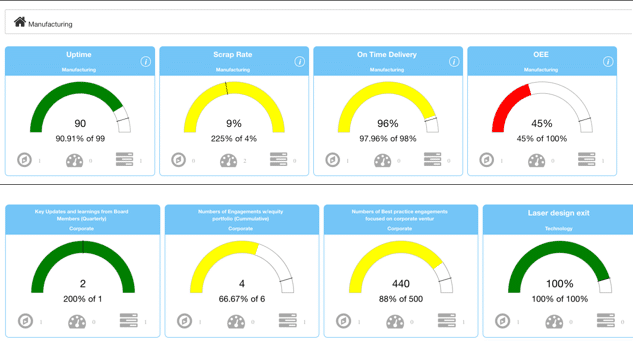
The typical KPI Fire metric tile shows a performance indicator in a single, glanceable view.
- Metric Title: Clearly identifies the KPI being tracked (e.g., OEE, Uptime, On-Time Delivery, etc.)
- Actual Value: The most recent data point for the metric.
- Visual Status: A background color that indicates performance relative to the target:
- Green (Good): Performance is meeting or exceeding the desired target.
- Yellow (Warning/Acceptable): Performance is below target but above a critical threshold. It indicates a need for attention.
- Red (Critical/Bad): Performance has fallen below the critical threshold, indicating a significant problem that requires immediate corrective action.
- Trend Line (Sparkline): A small line graph often included to show the performance trend over a recent time period, providing context on whether the metric is improving or declining.
Control Charts
Another example is the Control Chart for Statistical Process Control.
A Control Chart tells you if your process is “in control” (stable and predictable) or “out of control” (unpredictable).
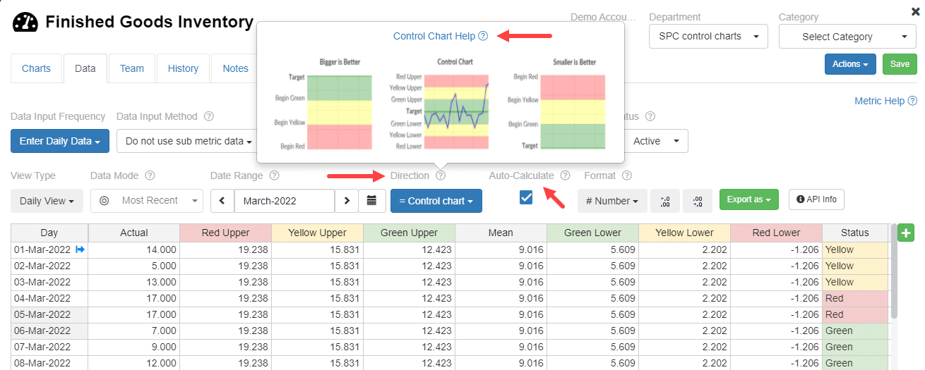
This chart is considered “smart” because it uses Statistical Process Control (SPC) to analyze your KPI data, allowing you to differentiate between normal, expected routine variation (which you should ignore) and true, significant signals (which require action).
All of these elements align with the SMART principle by instantly communicating if the goal is being met, making it easy for users to quickly identify areas that need attention and link them to corresponding projects or ideas in the app.
Ready to end spreadsheet frustration and align your entire team? Request a demo now to see exactly how KPI Fire’s Smart Charts translate strategy into tangible, continuous improvement. Don’t just track your KPIs—turn them into action.


