
How to Use Control Charts
Control Charts or Statistical Process Control Charts (SPC) are a great tool for monitoring the variation in a process and can signal the need for corrective action by identifying special causes.
What is a Control Chart?
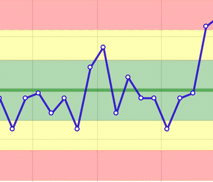
Control charts or Statistical Process Control charts (SPC) chart that shows how a process is performing over a period of time. By comparing the actual data to a set of expected ranges you can visually see if a process is operating in a consistent manner (in control), or if it is unpredictable (out of control) or affected by special variation.
How Do They Help Save Time and Reduce Waste?
By using a Process Control chart, the manager of a process can avoid time spent reacting to signals that might not have a meaningful root cause. Remember, two data points is not a trend. Just because your number is down today vs yesterday does not mean the sky is falling. And just because tomorrow is better than today, does not mean you have fixed everything. A process control chart will help you better understand what the real “voice of your process” is.
Normal Variation vs Special Cause Variation:
Every process has a certain amount of normal variation. Managers of a process should avoid reacting (positively or negatively) to Normal Variation. Normal variation is that which is caused by common causes.
Special Cause Variation
Special variation is variation that is caused by something outside of the normal process. When special variation occurs a reaction or explanation may be warranted.
How are the control limits or zones determined?
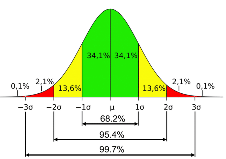
The zones should be calculated, not based on arbitrary input. KPI Fire calculates these automatically, based on your “Actual” value inputs and the standard deviation of your data set.
Process Limits in KPI Fire are automatically calculated based on the Actual data that is entered, since the last reset point.
- Mean = Average of all data points
- Green Limits +/- 1 Sigma
- Yellow Limits +/- 2 Sigma
- Red Limits +/- 3 Sigma
Note: KPI Fire does offer a setting to turn off the auto-calculate option. Uncheck the box if you want to use limits different from what is auto-calculated.
4 Rules that can signal an “out of control” condition
If any of these conditions are present you may have special cause variation that warrants investigation.
Rule 1: Any data point outside of the 3 Sigma limits. (outside Red)
Rule 2: Two of three successive points fall outside the 2 Sigma limit (in Red)
Rule 3: Four out of five successive points fall outside the 1 sigma limit on the same side of the median. (in Yellow)
Rule 4: Eight consecutive points fall on the same side of the central line.


How to Use Control Charts in KPI Fire
- Create a new metric
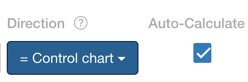
- Set the Direction attribute to : Control Chart
- Set Input Frequency to Weekly or Daily.
- Enter Actual values only. As you enter your actual values, the mean and each of the green,yellow and red zones will automatically calculate.
- Green Zone = +/- 1 𝝈 (1 standard deviation)
- Yellow Zone = +/- 2 𝝈 (2 standard deviations)
- Red zone = +/- 3 𝝈 (3 standard deviations)
How to add a Control Chart to a Huddleboard
- Create a Huddleboard
- Add new tile. Select desired Metric. (note: metric must be configured with Direction = Control Chart)
- Select “Line” chart type.