When tracking Key Performance Indicators, it is highly important to keep the data simple and the conclusions clear. KPI Fire is a tool that can create powerfully simple and visually clear dashboards for any organization.
KPI Fire has 3 main record types:
- Goals.
- Metrics.
- Projects.
This post will share many of the features and benefits of the METRICs feature in KPI Fire.
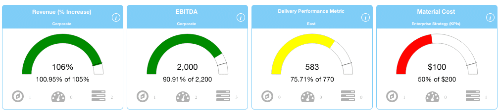
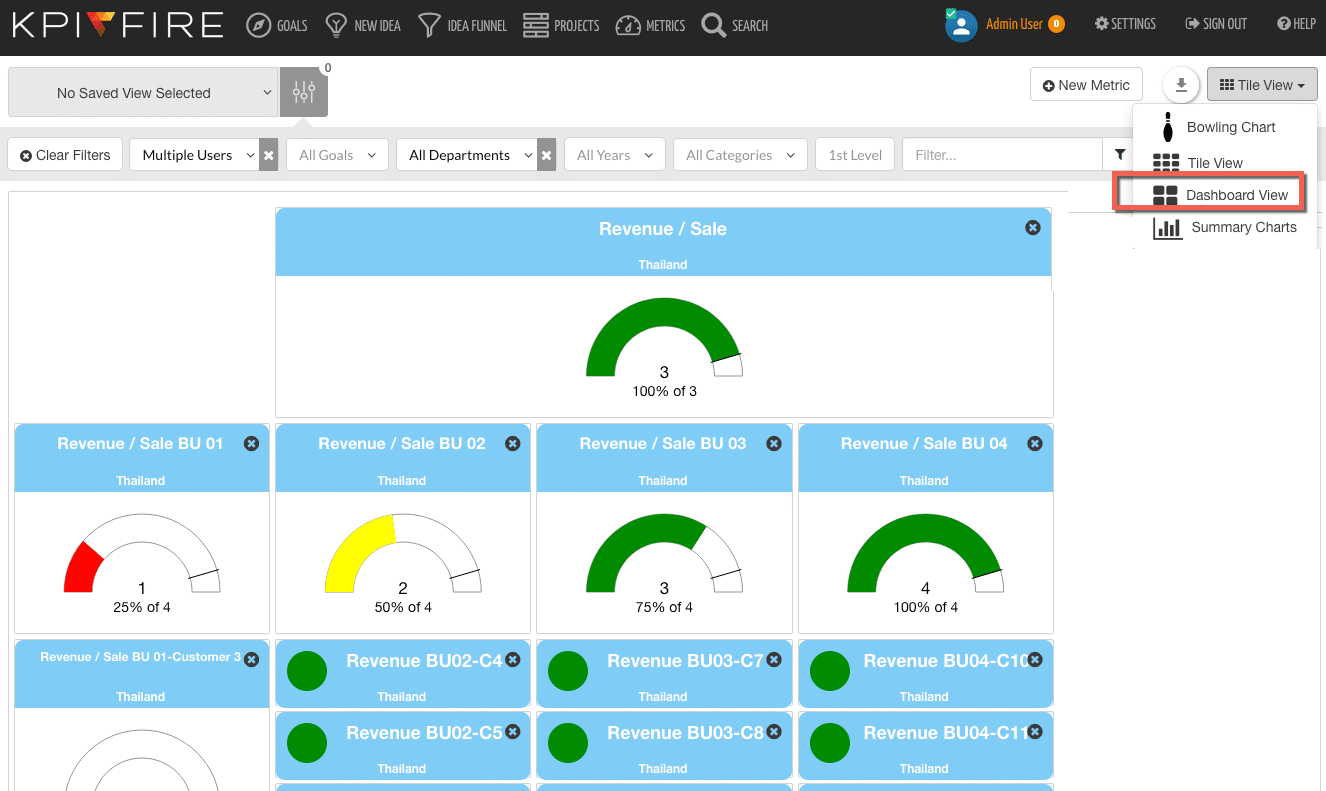
Metrics are in the light blue tiles; and they have a primary view that looks like a rainbow chart.
These Key Performance Indicators have three color zones indicated in these rainbow charts.
The colors of the chart are:
- Red (bad)
- Yellow (middle)
- or Green (good)

You can also toggle through the metric tiles to see additional views.
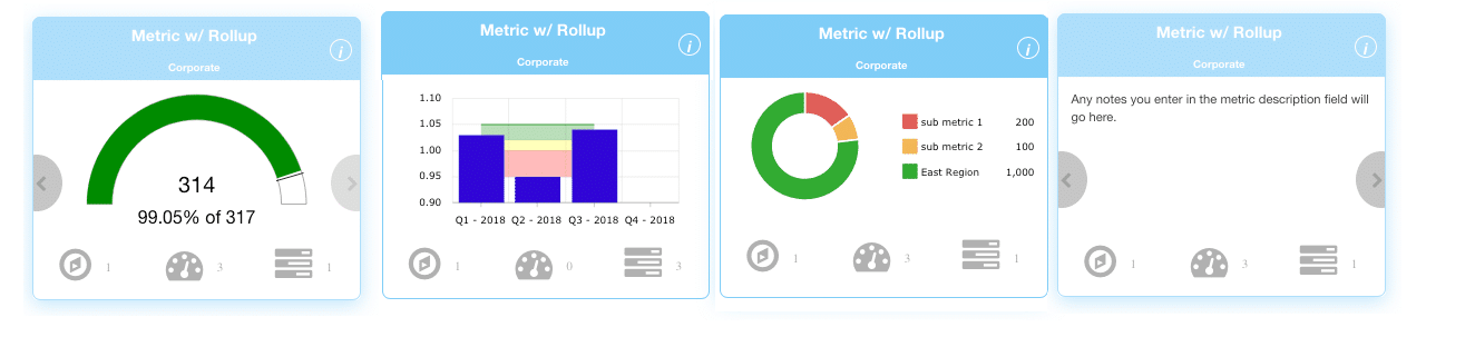
Quickly open Metrics to their detail page by clicking on the Metric name.
By developing numerical plans with zones of Green, Yellow, and Red; an organization/team/person is able to see how they are performing. They can also get a good idea for if their current level of performance is going to get them to meet their goal or not.
Keeping Score has numerous advantages:
- Celebrate successes– Everyone loves to feel successful. Having a scorecard “in the green” is a feeling of accomplishment and success that fuels other successes.
- Instigate action– When a metric is in the yellow, a heightened sense of alertness is appropriate. You might find yourself quickening the pace of project reviews, or spending more time on the projects
- Cause panic – Well, you may not want to cause a panic in every situation; but if your Key Performance Indicators are important enough (and it is showing you that you are not going to hit your goal,) panic might be appropriate.
Standardization of best practices improve overall quality of your performance management processes
Create Standards
Metrics in KPI Fire provide a standardized way for any accountable person to show their progress toward a goal. They can do this by utilizing the visual cues of Red, Yellow, and Green Zones. The format used in KPI Fire encourages a user to think about multiple scenarios in their planning and to determine each of the zones’ parameters.
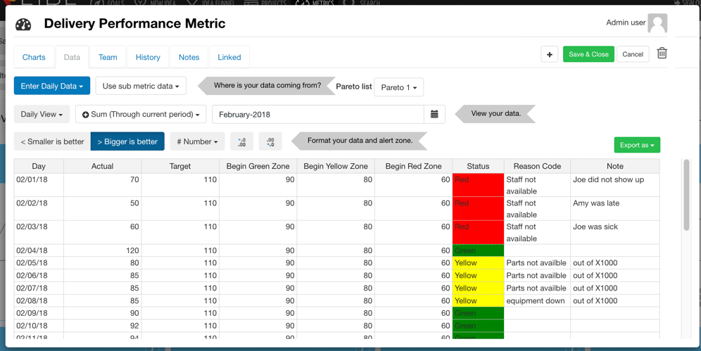
- Actual = the actual number that you will enter as time goes on.
- Target = Your “stretch” goal.
- 1) Begin Green = The line between green/yellow zones.
- 2) Begin Yellow = The line between yellow/red zones.
- 3) Begin Red = The bottom boundary of your chart.
Other Settings & Tips
- Smaller is Better: Select this if your metric is best when the number is smaller. (example: Accident days, or returns)
- Bigger is better: Select this if your metric ideal is a a larger number. (example: Sales, or Productivity per hour.
- You can export a template from the green export button.
- Sum/Average/Most Recent: Select which option you want to display on your rainbow chart.
- Change Number formatting for #, $, or % metrics.
- Select number of decimal points to display.
- KPI Fire knows what period you are in at any given time and shows the summarized data based on that time period.
Metric Alerts: Send a Notification when a Metric is in Red/Yellow Zone
Keeping score is great, but if you don’t notice that you are falling behind your plan you may not have time to correct it. The new metric notification feature allows you to enable Alerts for various people for each metric. If a metric receives an input (manual or imported), that puts the most recent data point in the Yellow or red zone, an email alert will be sent.
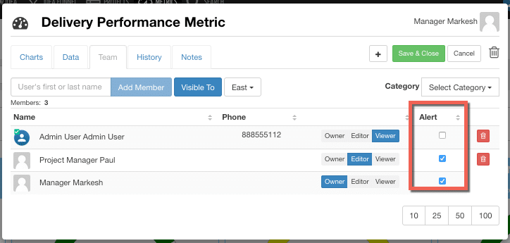
An email will be sent to each person indicated by the “Alert” checkbox.
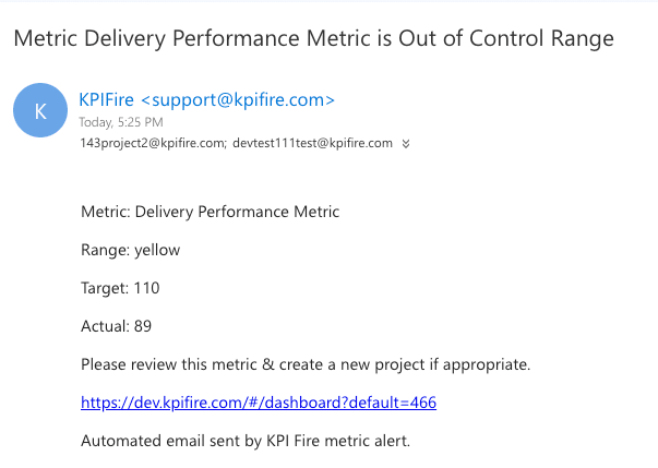
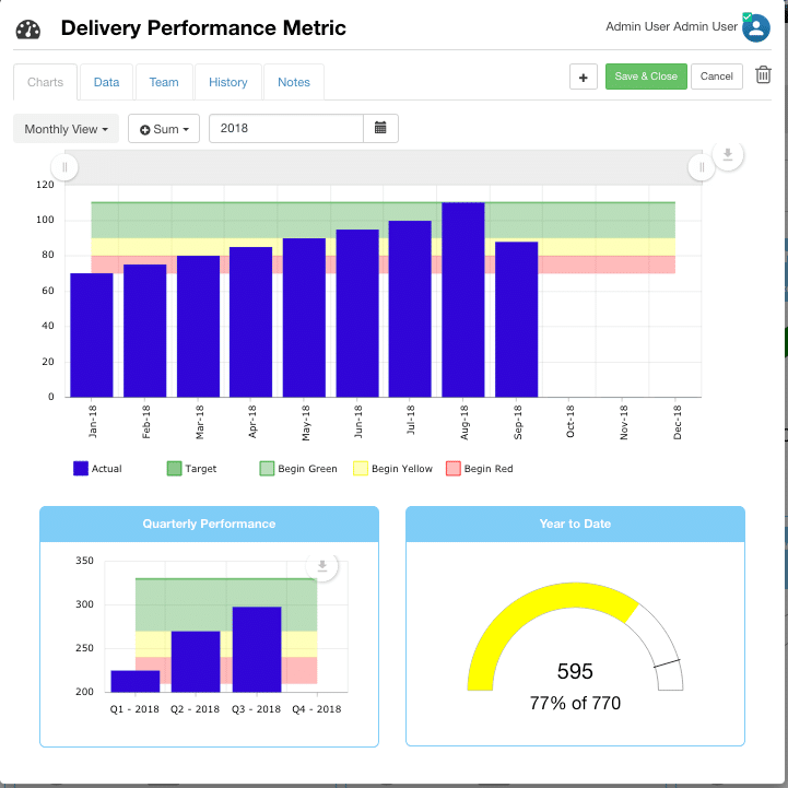
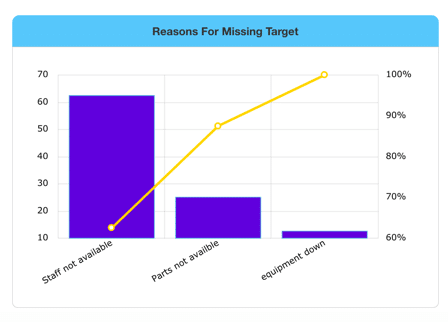
The Alert includes a link directly to the metric. From there the user can review the data with the Pareto chart.
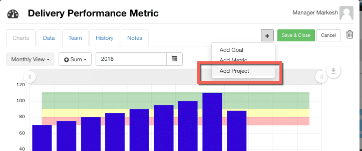
You can create a new project based on the data.
How to get the data “In” to your metrics:
1) Option A: – Manual Input. You can locate each tile separately & open it by clicking on the metric name, then go to the data tab. You can edit the metric directly from there.
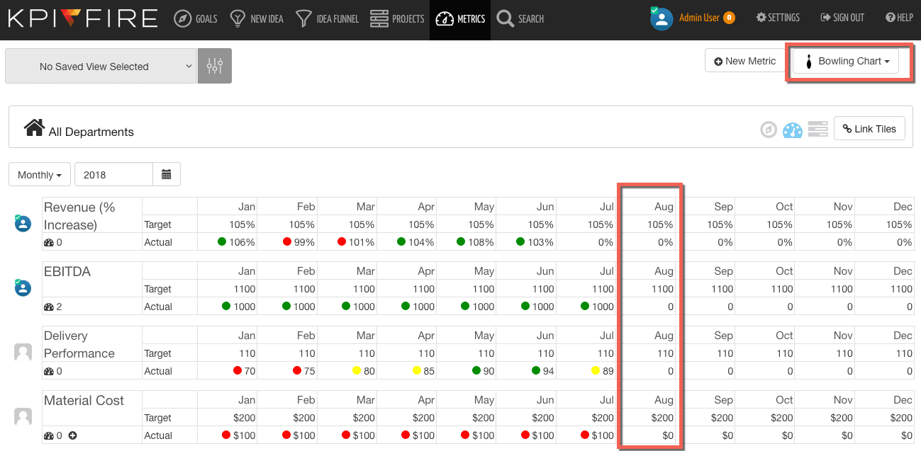
2) Option B: To save time and clicks, you can use the metric bowling view to see your list of metrics and update directly.
.
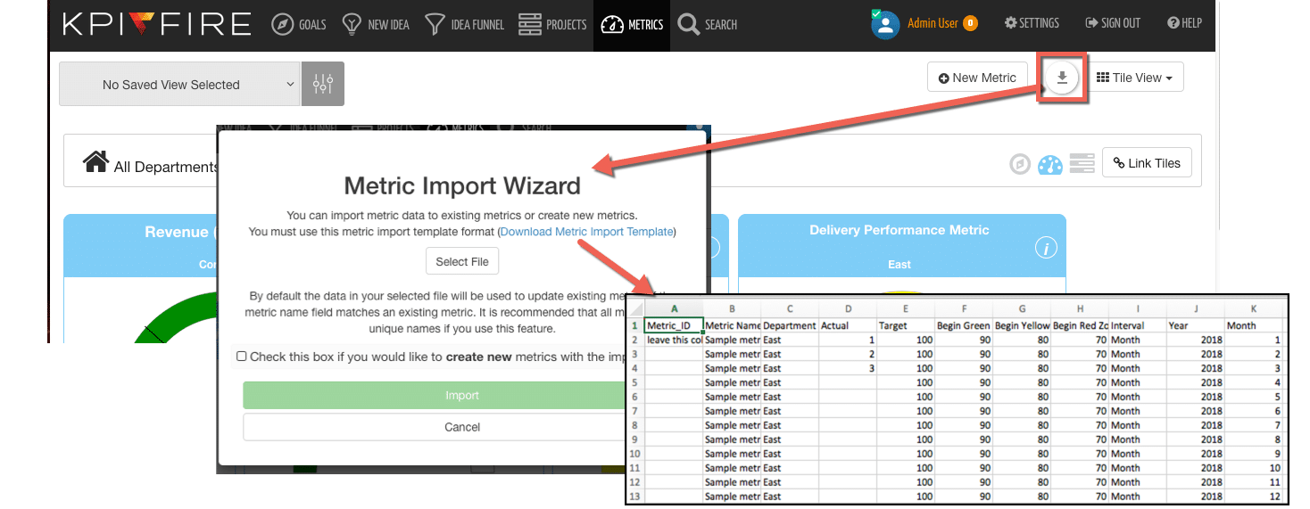
3) Option C- An even faster input method is to use the CSV Import option found on the metric Tile view.
4) Option D- For real time metric updates via API- Integrate with over 1000 apps via Zapier .Contact your account manager or technical support for more details.
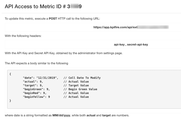
5) Custom Program API – KPI Fire provides REST APIs so you can send data directly to metrics.
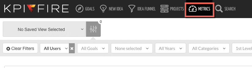
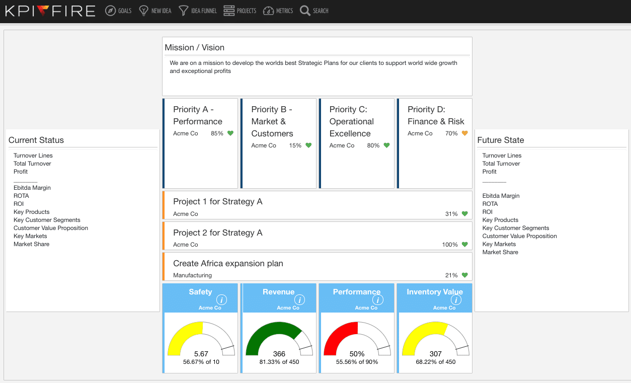
Create Custom Dashboards
From the metrics tab, select the dashboard view to create a new dashboard. Metrics can be placed on the screen and drag/drop into position to create customized dashboards to fit your needs.


